
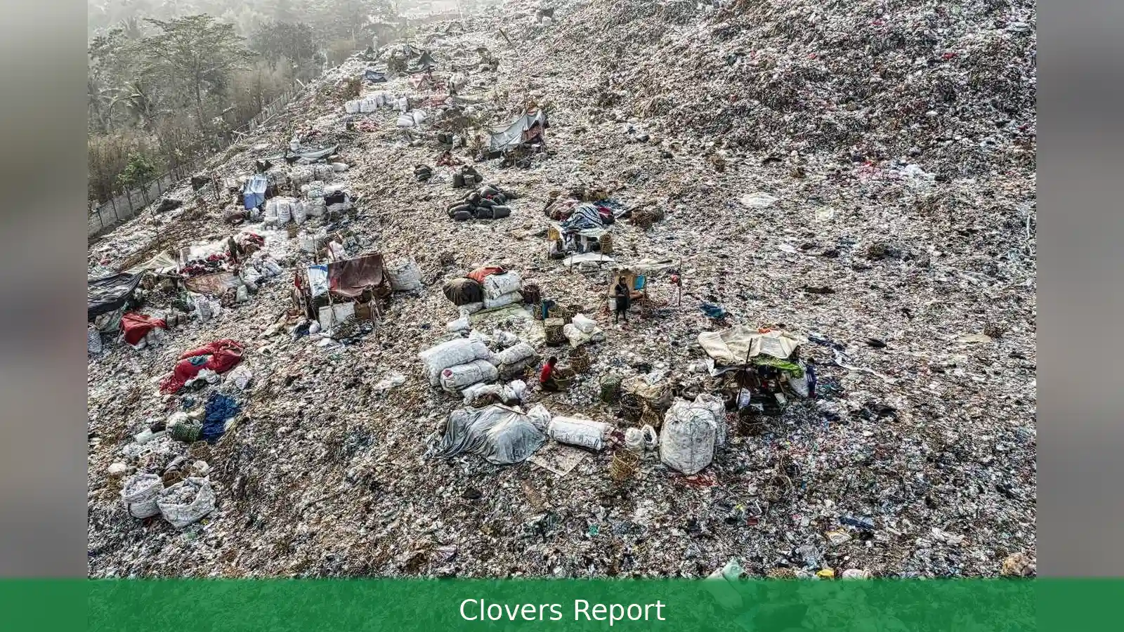
Here’s a short guide to what 'dirtiest' will mean in 2026, where to pull the official numbers, and a simple, step-by-step way to check countries — start with air data, then add water and sanitation. Quick facts first, then the how-to.
Quick reference summary
- I use national annual average PM2.5 as the main metric (µg/m3). Check the WHO and EU standards yourself — different agencies publish different target values, and you should note which one you’re using.
- Sample 2026 figures highlighted: India — PM2.5 50.6 µg/m3; Iraq — PM2.5 38.4 µg/m3; Ghana — PM2.5 35.8 µg/m3. Those figures illustrate high exposure when set against the WHO guideline.
- Key public data portals (free): gov.ie, epa.ie (Ireland), who.int, eea.europa.eu, iqair.com, worldbank.org, washdata.org (WHO/UNICEF JMP).
- Do a quick national PM2.5 comparison first, then layer on population-weighting and basic sanitation so you don’t miss where people actually live and drink water.
Prerequisites: what you need before you start
Basically, get a spreadsheet program (Excel, Google Sheets) and basic familiarity with CSV files. If you want maps, install QGIS or use Google My Maps. Have a web browser ready and an account for any platform that asks you to sign in — but most official datasets are free without registration.
Decide the scope: national-level comparisons are fastest. Subnational analysis — cities, counties — needs more data and time. Pick a comparator set: all UN countries, OECD members, or a regional subset (South Asia, West Africa, EU). That affects how you download and filter the data.
Why “dirtiest” needs a method
"Dirtiest country in the world" sounds dramatic. But it’s a label tied to measurable pollution indicators — usually air quality (PM2.5), water contamination, lack of sanitation, and unmanaged waste. Some rankings use only air data; others mix many indicators. So the first step is to decide which indicator matters most to the question you want to answer.

Air pollution is often the simplest thing to compare, since several global datasets list national PM2.5 averages — but check each dataset’s coverage and year before you trust a direct comparison. Water and sanitation use different measures — percent of population with basic sanitation, percent with safely managed drinking water — and come from the WHO/UNICEF Joint Monitoring Programme (JMP). Waste management data are patchier; the World Bank and UNEP publish reports and country profiles, but methods vary.
Where to get official data (Ireland-friendly)
Most authoritative datasets are free to download. A good starting list:
- Irish Government portal: https://www.gov.ie — for policy and Ireland-specific comparisons and links to agencies.
- Environmental Protection Agency (Ireland): https://www.epa.ie — national air and water monitoring data, annual reports, and data downloads.
- World Health Organization ambient air quality database: https://www.who.int — download country-level PM2.5, including method notes and year of observation.
- European Environment Agency (EEA): https://www.eea.europa.eu — EU country comparisons, EEA reports, and ambient air quality datasets with station-level detail.
- IQAir global air quality platform: https://www.iqair.com — searchable PM2.5 country pages and recent rankings; useful for month-by-month trends and live maps.
- World Bank / Our World in Data: https://www.worldbank.org and https://ourworldindata.org — broader environmental, development, and health indicators you can merge with air data.
- WHO/UNICEF Joint Monitoring Programme (JMP): https://washdata.org — sanitation and drinking-water coverage by country and year, essential for water/sanitation comparisons.
Step-by-step: how to check and compare countries
- Pick your metric. For a quick headline, use national annual average PM2.5 (µg/m3). For a wider view, combine: 50% air (annual PM2.5), 30% water/sanitation (JMP indicators), 20% waste management (national-reported collection and disposal rates). Those weights are illustrative — pick weights that match your question.
- Download the air data. From WHO ambient air quality database download the CSV for "annual mean PM2.5". WHO tables typically indicate the measurement year — note that 2026 global updates may include 2024–2025 observations for many countries. IQAir provides a 2026 snapshot on country pages; use that for recent trends but cross-check with WHO for long-term comparison.
- Add population figures. Get population totals from the World Bank (https://data.worldbank.org/indicator/SP.POP.TOTL). To compute population-weighted PM2.5, either use population distribution rasters (if you have GIS skills) or use national population to present national averages. Population-weighted PM2.5 usually better reflects actual exposure because it gives more weight to where people live; treat this as the more realistic exposure measure when you can calculate it.
- Download water and sanitation data. From JMP (https://washdata.org) get country-level indicators: percentage using basic sanitation, percentage with safely managed drinking water. Record the year of observation — many entries are for 2020–2024.
- Collect waste-management indicators. This is harder — check World Bank environment indicators and national environmental agency reports (for Ireland, see EPA). Useful metrics: municipal waste generated per capita (kg/year), recycling rate (%), share of waste safely disposed (%). If national reports are absent, use regional averages from UNEP or World Bank country notes.
- Normalise each indicator. Convert each metric to a 0–100 scale where 0 is best and 100 is worst. Example for PM2.5: 5 µg/m3 (WHO guideline) → 0; 60 µg/m3 or more → 100. For sanitation: 100% basic sanitation → 0; 0% → 100. Keep the same direction across metrics (higher score = worse).
- Combine into a composite score. Multiply each normalised score by your chosen weight and sum. That gives a comparable “dirtiness” score for each country. Rank the countries by composite score.
- Check subnational data if needed. If a country has a big urban-rural split, compare major cities and rural regions separately. Many EEA, EPA and IQAir pages provide station-level or city-level PM2.5.
- Publish with context. Always show the raw PM2.5 value, the year of observation, and the sanitation metric year. For example: India — PM2.5 50.6 µg/m3 (2024–25 estimate); basic sanitation coverage: X% (JMP 2022). That transparency helps readers interpret the ranking.
Tips for faster, more reliable comparisons
Use the WHO data as the backbone — it's harmonised and gives the measurement year. But cross-check IQAir for the latest months.
For Ireland comparisons, use EPA Ireland dashboards to see how Ireland's annual PM2.5 (typically in the single digits) compares to high-burden countries.
Automate repetitive work: write a short script (Python/pandas or R) to load CSVs, normalise fields, compute weighted scores and export a ranked table. That saves hours when you update the list each year. Still, document the code and the weight choices so others can replicate your results.
Be careful with small island states and low-population countries — a single coal-fired plant or seasonal dust event can spike national averages. Look for multi-year averages where possible.
Common mistakes to avoid
- Don’t compare different years without noting them. A 2022 PM2.5 value vs a 2025 value distorts rankings.
- Don’t mix measurement methods silently. Satellite-derived PM2.5 and ground monitoring can differ; state which method you used.
- Don’t treat a single metric as the whole story. High PM2.5 tells about air exposure, but a country with clean air may fail badly on sanitation or waste management.
- Don’t ignore population exposure. A low national mean but high urban hotspots matters — and population-weighted PM2.5 usually gives a truer picture of human exposure.
- Don’t copy a headline ranking without showing the maths. Publish the raw numbers, the weights, and the normalisation method.
Labels like "dirtiest country in the world" grab attention — but they hide nuance. Use clear, repeatable metrics (annual PM2.5 as a start), public datasets (WHO, IQAir, EEA, EPA Ireland, World Bank, JMP) and a transparent step-by-step method: pick metrics, download the CSVs, normalise, weight and combine. For 2026, check the WHO ambient air database and IQAir country pages for the latest PM2.5 figures — then add JMP sanitation data and national waste figures to get a fuller, fairer ranking.
This article was created with AI assistance.


